Grant management is a complex process that requires careful tracking, analysis, and reporting. As such, it’s crucial to effectively interpret and communicate data in order to make accurate decisions and demonstrate impact.
This is where data visualisation plays a vital role, helping funders operate with clarity, accuracy and transparency. This article will explore in detail how data visualisation improves grant management processes on the whole.
Why Do You Need Data Visualisation in Grant Management?
Intuitive Understanding & Greater Productivity
As helpful as standard reporting is, a lack of visual representation of it can lead to information overload, overwhelming grant managers and slowing the decision making process – especially those who are visual learners (the majority of the population).
However, it may not just be visual learners that need to see data in this format in order to make swift interpretations. Various neuroscientists have discussed how humans are hardwired to process visual cues far more easily than language or written data (after all, language is a new thing for us humans, relative to the amount of time we’ve existed).
In fact, research from the University of Pennsylvania showed that the human retina can transmit information at a rate of 10 million bits per second, similar to an Ethernet connection.
With information presented in a clear visual format that takes a fraction of the time to understand, grant managers and other stakeholders can gain quick insights and a holistic view of grant performance.
Improved Decision-Making
Data visualisation supports evidence-based decision-making by deriving meaning from the raw data.
With visually represented data, staff can identify trends, correlations, and outliers more effectively. They may also uncover insights that would not be so apparent by looking at the raw numbers alone.
As a result, data visualisation in grant management has the potential to improve the allocation of resources, help adjust strategies, and facilitate decisions that have maximum impact.
Clear Communication
Clear communication is vital when presenting any type of data to stakeholders, whether that’s about programme outcomes, financial data or performance against any other KPIs.
Different stakeholders have varying levels of skill in data analysis. Visualisations bridge the gap between raw data and stakeholders with a non-technical background, allowing information to be presented in a compelling and easily digestible manner.
Various types of charts are available, such as comparison and trend charts. Comparison charts allow grant managers to view different groupings of data – for example, the number of grants awarded in 2023 for each region. Trend charts help in showing the big picture, revealing patterns in grant management processes and funding over time, for example.
Real-Time Data
Cloud based data visualisation tools that operate in real-time provide current information; on the other hand, reports can quickly become outdated when operating in a dynamic environment with continually changing data.
Greater Engagement
Let’s face it – sorting through data is not something that most of us look forward to when we wake up each morning. Through data visualisation, an activity that may otherwise be seen as dry and boring is transformed into something effortless and aesthetically pleasing.
What Insights Can Data Visualisation in Grant Management Provide?
A few examples of the types of insights one may uncover through data visualisation are as follows:
- Funding allocation: Grant managers can view data related to funding allocation, such as the distribution of funds across different grant programs, departments, or geographical regions. This helps to identify patterns, imbalances, or the need for adjustments.
- Applicant demographics: Visualising data on applicant demographics can provide grant managers with a clear understanding of the target population. This may include visualising data on age, gender, ethnicity, income levels, education, or other relevant factors. Such insights help in assessing the reach and impact of grants and ensuring equitable distribution.
- Application metrics: Data related to the grant application process may help improve grant management processes. Data points may include the number of applications received, acceptance rates, rejection reasons, or time taken for review. Visualising these metrics helps identify bottlenecks and optimise resource allocation.
- Performance and impact: Tracking the performance and impact of funded projects may involve viewing data on project outcomes, outputs, milestones achieved, community engagement, and other KPIs.
- Financial tracking: Data visualisation provides a convenient way to track financial information such as budget utilisation, expenditure patterns, cost efficiencies and more.
- Compliance and accountability: Visualising data related to compliance and accountability measures enables grant managers to ensure adherence to guidelines and identify areas for corrective action.
How to Get Started with Data Visualisation
The first step in implementing data visualisation is to use a cloud based grant management system. This ensures a centralised data source and enables the use of real-time data. Possible next steps are listed below.
Identify Key Objectives
Determine the objectives you want to achieve through data visualisation in grant management. Consider what insights or information your organisation needs to improve your processes, support decision-making and monitor performance. This will provide clarity by informing the types of data your grant managers need to track.
Select Data Visualisation Tools
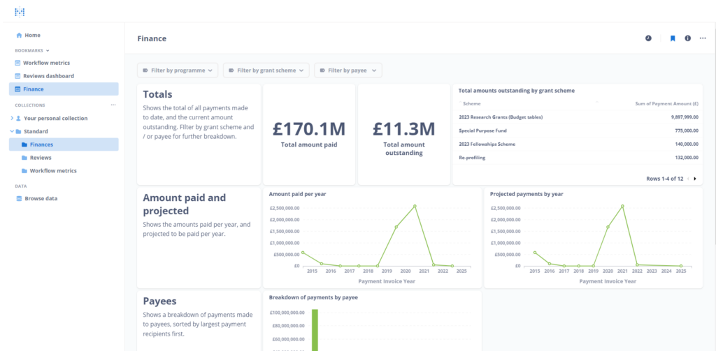
Not all grant management systems come with data visualisation tools. However, Flexi-Grant does (see below). If using external tools, consider factors such as ease of use and integration capabilities.
Clean and Prepare Data
If you are not using a data visualisation tool that is built into your grant management system, you may need to prepare the raw data before it can be of any use. This can involve removing duplicate or incorrect entries, standardising formats, and transforming the data in some case.
The need to clean data is usually required when working with data from multiple sources which, again, highlights the convenience and time-savings that come with using a platform that centralises everything.
Determine Which Visualisation Techniques to Use
Based on the type of data and objectives, select appropriate visualisation techniques that will help to clearly convey the insights you want to communicate. Common visualisation types include bar charts, line charts, pie charts, scatter plots, maps, heatmaps, and dashboards.
Use Interactive Dashboards
Consider using interactive dashboards that allow grant managers to explore and interact with the data. They provide a consolidated view of multiple visualisations and enable users to drill down into specific details or filter data based on criteria.
Iterate and Improve
As with all business processes, data visualisation is an area for continuous improvement. Keep refining your data visualisation practices based on stakeholder feedback and your organisation’s evolving needs.
How Flexi-Grant Supports Data Visualisation
Not all grant management systems come with data visualisation tools. As a result, funders often have to invest in external tools.
However, due to our philosophy of continual improvement in our software, Flexi-Grant now comes with a new data visualisation campaign insight tool, providing the ultimate oversight for your schemes.
Conclusion
Data plays a vital role in grant management for decision-making, reporting and compliance purposes. Thus, the importance of data visualisation cannot be overstated.
Transforming complex data into clear, visually appealing representations allows for the clearest insights and enhances communication with a broad range of stakeholders that have different levels of experience with data. It also reduces information overload, enhancing productivity and reducing cognitive load for grant managers so they may operate more efficiently.
Fluent Technology is the UK’s leading provider of grant management software – to see Flexi-Grant in action, contact us today to book a demo.